


What are CSS Frameworks?
CSS Frameworks are also known as CSS libraries which are used to simplify styling of a webpage. These libraries helps us to write CSS faster. Some of the CSS Frameworks are:
Bootstrap
Tailwind CSS
Foundation
Bulma
Skeleton
In this article we are going to discuss about Tailwind CSS ,one of the majorly used CSS Frameworks.
Tailwind CSS
Tailwind CSS is known as a utility first CSS Framework. Tailwind CSS has predefined classes which are to be written in the html markup. These classes(like flex, justify-between, bg, spacing) style the document without requirement writing CSS. It can make the website responsive.
Using Tailwind CSS
We can either install the Tailwind CSS or we can directly use it by the Play CDN to try it right in the browser without any build step.
For Installation:
Use this Link: Tailwind CSS
Play CDN:
<script src="https://cdn.tailwindcss.com"></script>
Write this code snippet of script tag in the head section of your html file. Now we can define classes for the body elements to style our webpage.
Core Concepts
Let us learn the core concepts by styling a webpage.
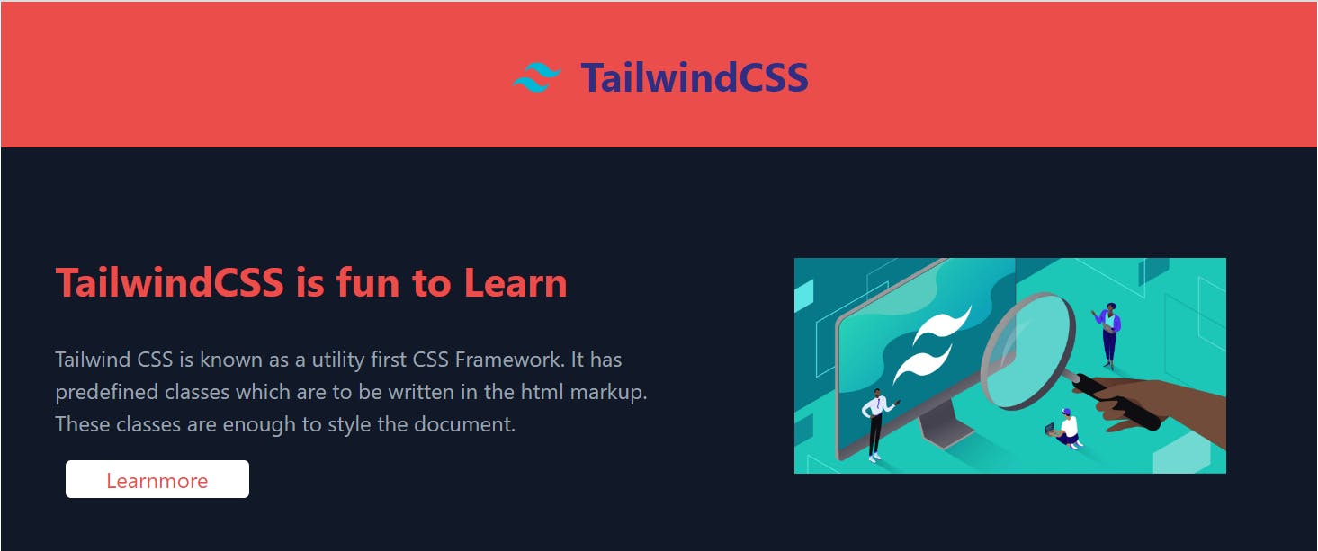
This is the image of webpage which is styled by using Tailwind CSS.
Let us look at the code for it.
<head>
    <meta charset="UTF-8">
    <meta http-equiv="X-UA-Compatible" content="IE=edge">
    <meta name="viewport" content="width=device-width, initial-scale=1.0">
    <title>TailwindCSS</title>
    <script src="https://cdn.tailwindcss.com"></script>
    <script>
        tailwind.config ={
            theme: {
                screens : {
                    sm:'480px',
                    md:"768px",
                    lg: "976px",
                    xl:"1440px"
                },
                extend: {
                    colors: {
                        grey:'#758283',
                        red: '#EB4D4B',
                        blue: '#3944F7',
                    }
                }
            }
        }
    </script>
</head>
This is the head tag, in which we provide the script tag to use tailwindcss as mentioned earlier. There is also a tailwind.config in the script tag.
CONFIGURATION
Because Tailwind is a framework for building bespoke user interfaces, it has been designed from the ground up with customization in mind.
By default, Tailwind will look for an optional tailwind.config.js file at the root of your project where you can define any customizations. Every section of the config file is optional, so you only have to specify what you’d like to change. Any missing sections will fall back to Tailwind’s default configuration.
Styling the Body
If we look at the image we can see that there is a header at the top, content at the left and image at the right.
Style the Heading
<body class="bg-gray-700">
    <nav class="relative container bg-red p-8 mx-auto  " >
        <div class="header flex items-center justify-center">
            <div class="pt-1">
                <img src="https://upload.wikimedia.org/wikipedia/commons/thumb/d/d5/Tailwind_CSS_Logo.svg/2048px-Tailwind_CSS_Logo.svg.png" alt="Logo" class="w-10">
            </div>
            <div class="head"><h1 class="ml-3 text-indigo-900 font-bold text-3xl">TailwindCSS</h1></div>
        </div>
    </nav>
</body>
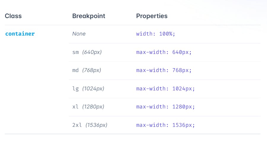
Container
A component for fixing an element's width to the current breakpoint.
Background Color
Here, we defined a class in the body tag as class="bg-gray-700". bg is a predefined class for background color. It changes the background color to gray shade of 700 of our page and also to red of our header.
Padding and Margin
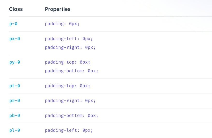
We can also add padding on one side:
p{t|r|b|l}-{size}
For example, pt-6 would add 1.5rem of padding to the top of an element, pr-4 would add 1rem of padding to the right of an element, pb-8 would add 2rem of padding to the bottom of an element, and pl-2 would add 0.5rem of padding to the left of an element.
FLEX:
Adds the flex property to the items.
flex-col-reverse this class changes the flex direction to column-reverse.
Justify-Content
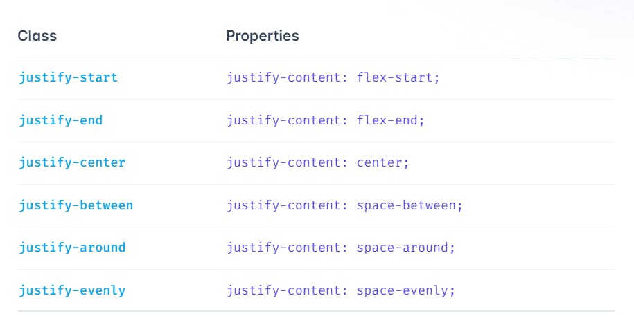
Responsive
    <section class="content">
        <div class="container bg-gray-900 pt-16 flex flex-col-reverse items-center md:flex-row mx-auto md:space-x-6">
            <div class="ml-10 flex flex-col md:w-1/2">
                <h1 class="mt-4 max-w-md text-3xl font-bold text-white text-center md:text-left md:text-red">TailwindCSS is fun to Learn</h1>
                <p class="text-left text-gray-400 pt-7">Tailwind CSS is known as a utility first CSS Framework. It has predefined classes which are to be written in the html markup. These classes are enough to style the document.</p>
                <div class="flex justify-center mt-4 md:justify-start">
                    <a class="border-transparent ml-2 mb-10 border-2 px-7 bg-white text-red rounded hover:bg-red hover:text-white hover:border hover:border-2 hover:border-white" href="#">Learnmore</a>
                </div>
            </div>
            <div class="md:w-1/2 flex justify-center items-center">
                <img class="w-80 mb-10"  src="https://kinsta.com/wp-content/uploads/2022/01/tailwind-css.jpg" alt="Tailwindcss">
            </div>

        </div>
    </section>
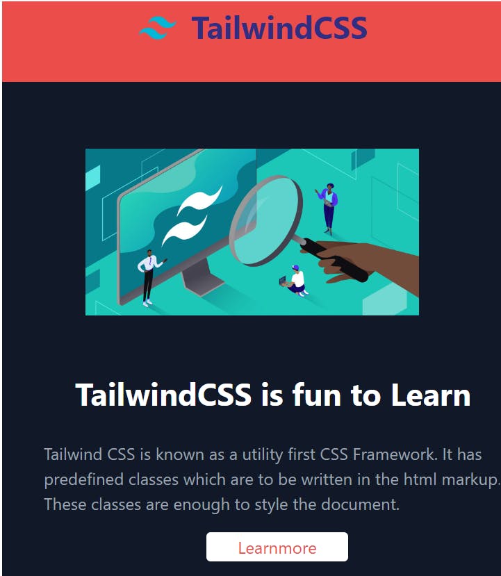
This section consists of content on left and image on right for screens of size md and wider. For screens of size sm ,the image goes on top of the content. Let us look at the code snippet to understand this better.
<div class="container bg-gray-900 pt-16 flex flex-col-reverse items-center md:flex-row mx-auto md:space-x-6">
This division has content and image.
md:flex-row mx-auto md:space-x-6-These classes displays the flex with a flex-direction-row for scrrens of size md and wider.
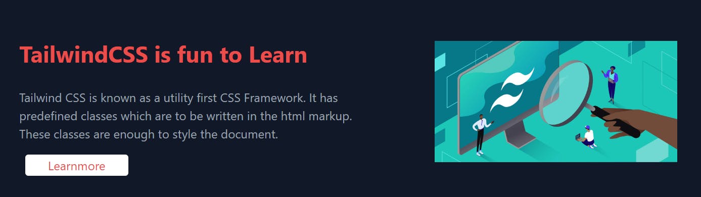
flex flex-col-reverse items-center -These classes arranges the image and content with a flex direction of column-reverse and align the items to the center.
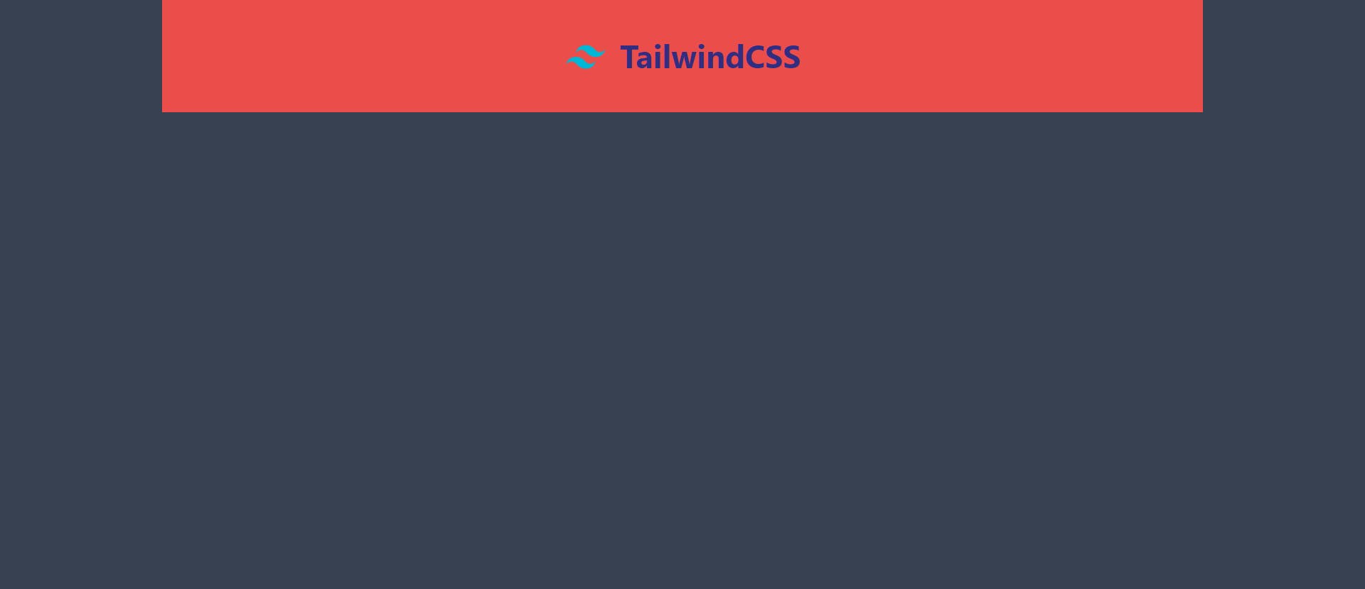
Screen size: sm
Styling a button
<a class="border-transparent ml-2 mb-10 border-2 px-7 bg-white text-red rounded hover:bg-red hover:text-white hover:border hover:border-2 hover:border-white" href="#">Learnmore</a>
- Hover
hover:bg-red hover:text-white hover:border hover:border-2 hover:border-white when we hover on the button the background color changes to red,border and the text turns white
Hover on the LearnMore button to see the changes.
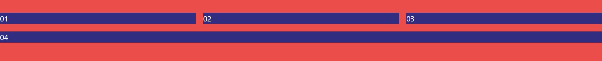
GRID
<div class="grid grid-cols-3 gap-4 mt-10">
        <div class="bg-indigo-900 text-white">01</div>
        <div class="bg-indigo-900 text-white">02</div>
        <div class="bg-indigo-900 text-white">03</div>
        <div class="col-span-3 bg-indigo-900 text-white">04</div>
      </div>
CONCLUSION
Tailwind CSS is highly customizable. It is easy to use and speeds up the creation and design process in the long run.
I hope this article has added value to your time.